NEXT
Designing the Future:

The Challenge
Imagine the world’s first developer event focused entirely on global tax compliance. It’s as niche as it sounds, and as technical as it gets. Avalara set out to unite technical leaders from around the world to code, learn, and shape the future of tax technology. With expert sessions, live demos, and real-time coding challenges, it became a playground for the people who build the backbone of online commerce.
A groundbreaking event like this couldn’t launch with an off-the-shelf look. It needed a brand identity that spoke the language of IT professionals, projected credibility, and still felt inventive and fresh. The design also had to live in Avalara’s visual world, borrowing its brand equity while standing apart as a distinct and recognizable event. My team and I were tasked with designing it all, from the logo to the full brand system, complete with guidelines that would keep every touchpoint sharp, consistent, and unmistakable.
Finding the Form
Fueled by coffee and creativity, my fellow designers and I explored numerous logo directions to define the brand.
Moving the brand forward
After fine-tuning our favorites, we presented them to leadership. The “ribbon” concept stole the show. Selected for its dynamic sense of movement, it embodies the forward momentum of the event name, NEXT. Clean, easily legible, and ready to roll, the design propels the brand into the future of global tax compliance while providing a versatile springboard for future design elements.
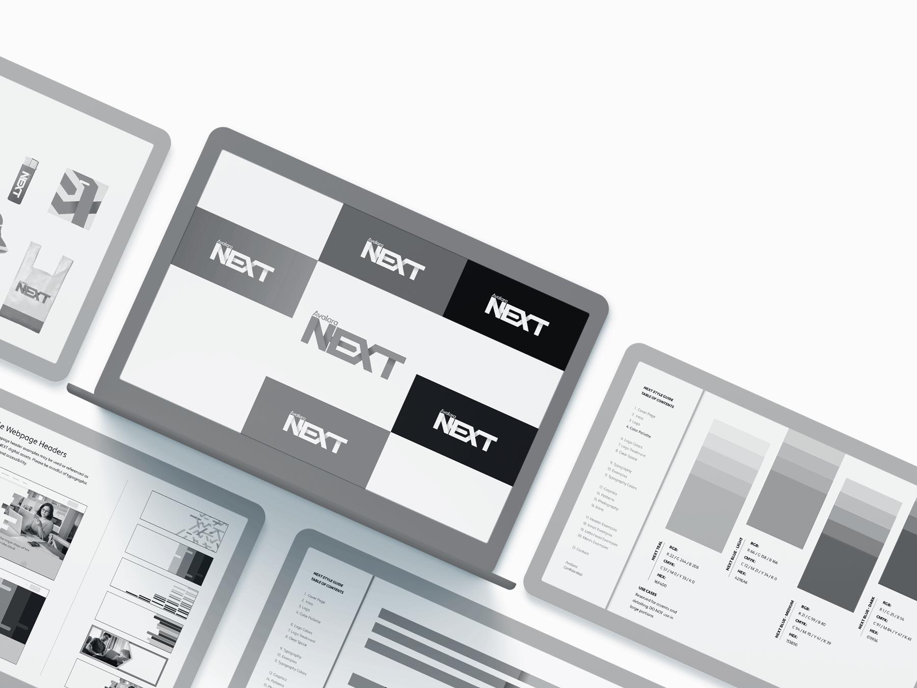
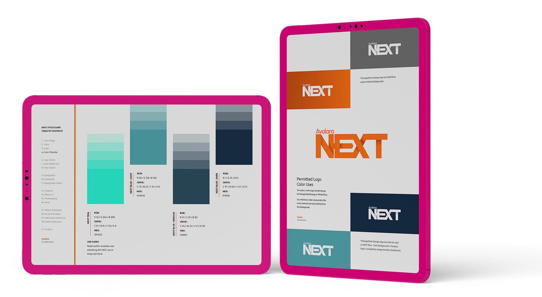
Building the Brand’s Look
With the final logo chosen, the next step was creating the brand guide. I started by crafting a mood board inspired by the ribbon logo, focusing on colorful paths, bold hues, and visuals that convey a strong sense of movement.


The Complete Brand Toolkit
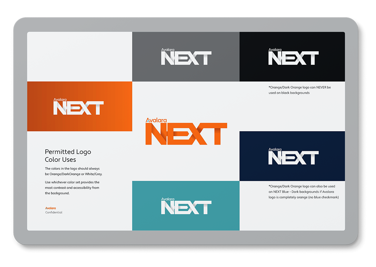
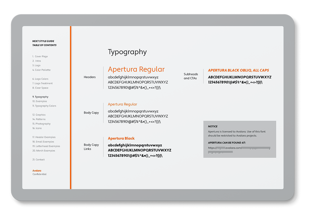
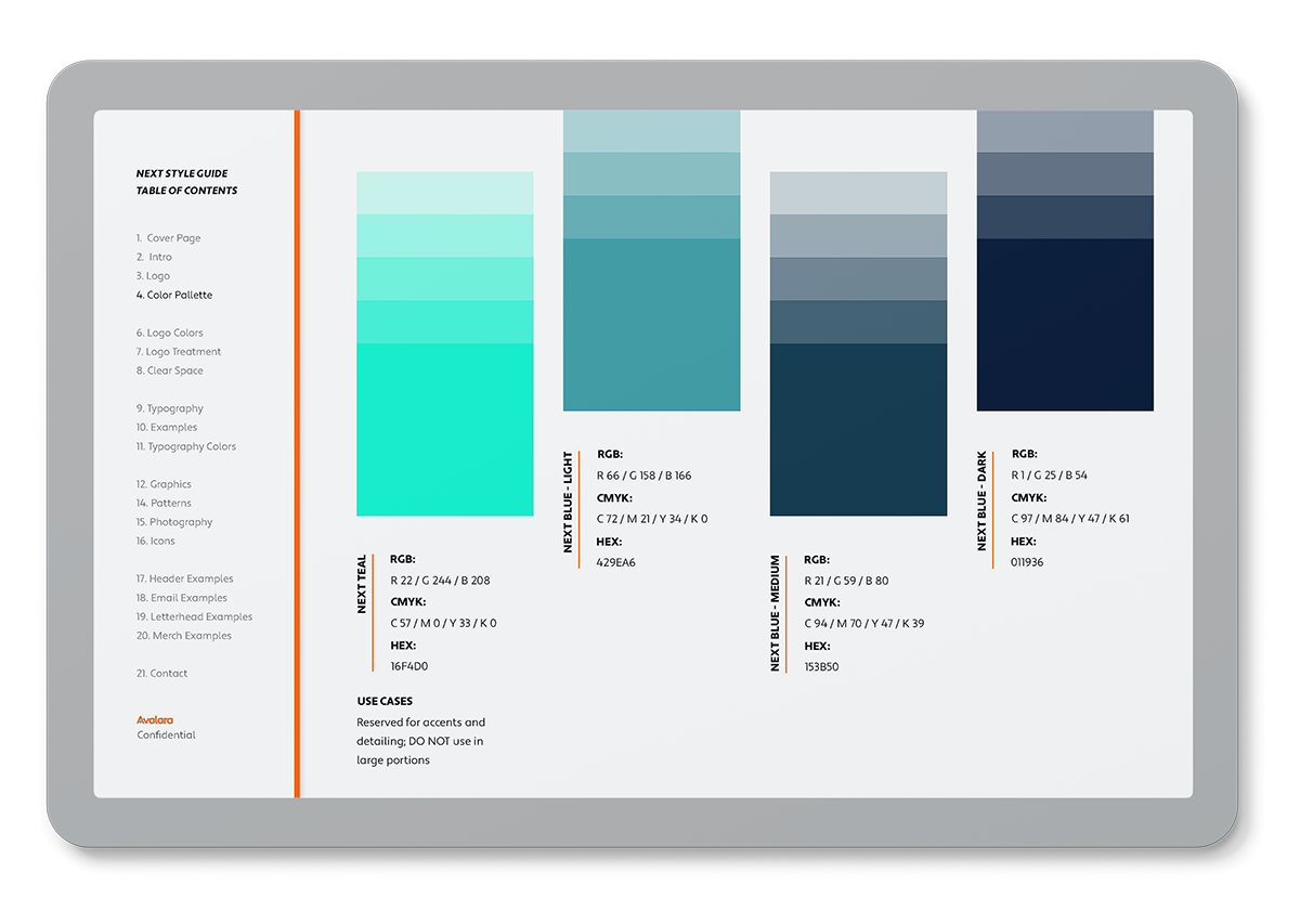
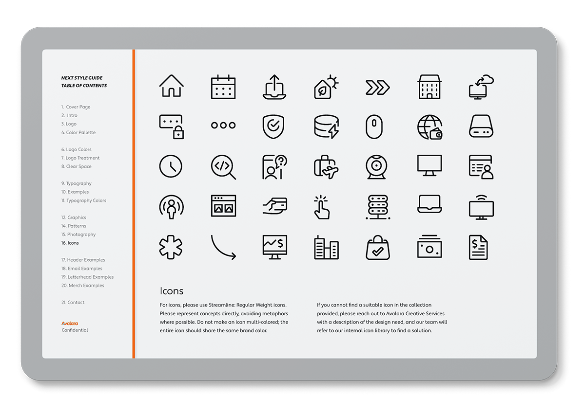
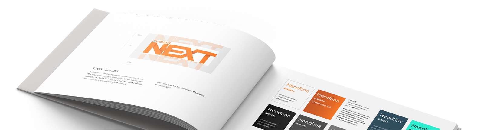
I designed the NEXT event brand guide to cover a wide spectrum of design elements. Starting with the essentials such as logo treatments, typography, and colors, I also provided guidance on iconography, graphic elements, and even approved stock photography. Clean and sleek, this go-to toolkit empowered any design team to create cohesive, on-brand materials for the event.

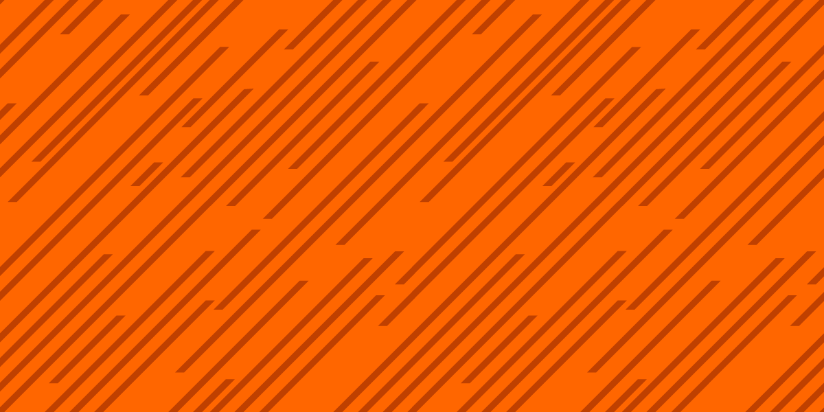
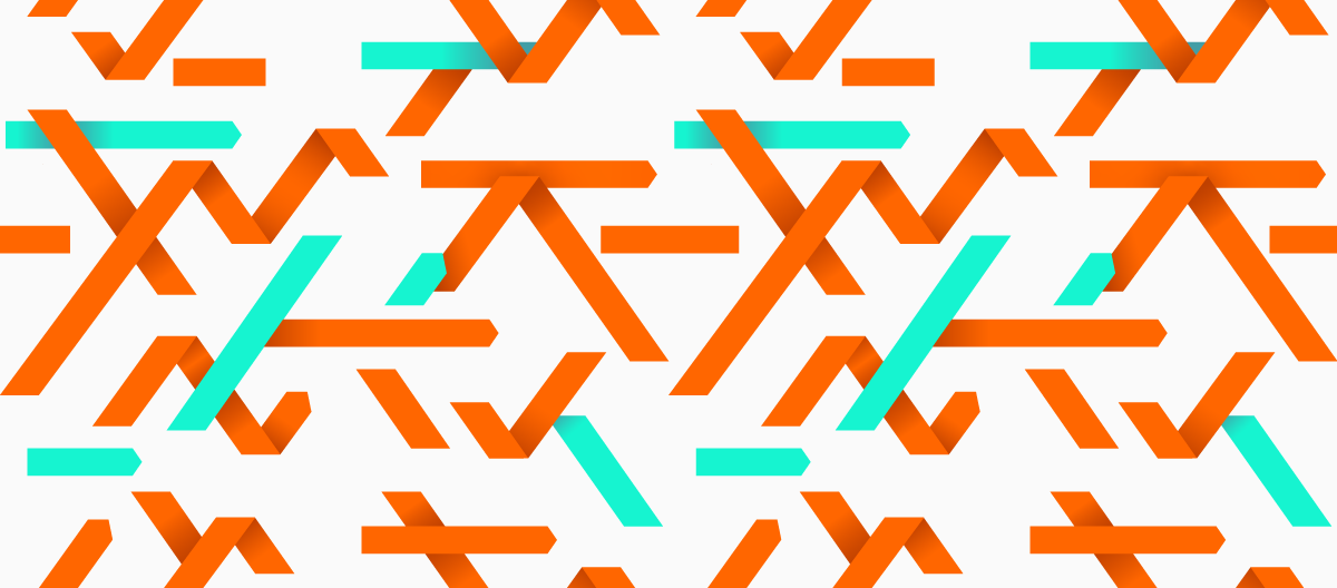
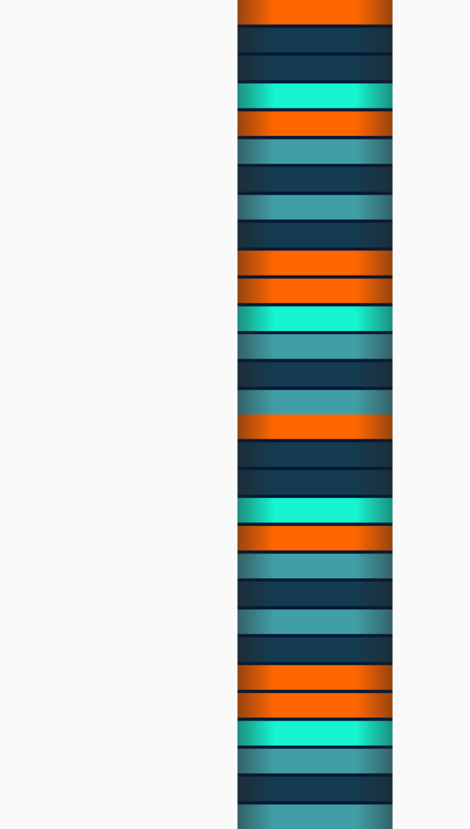
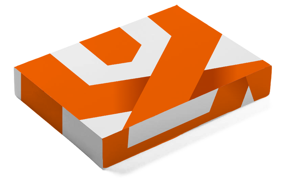
Pattern play
I designed three seamless patterns for the event, reinforcing the color palette and graphic accents throughout the brand. These patterns add texture and cohesion to the visual identity and helped inform the event material samples included in the brand kit.

With this brand guide in hand, my fellow designers and I delivered these samples to give the event team a strong starting point:
Animation
Title card loop, showcasing the logo being built.
social Ads


Emails
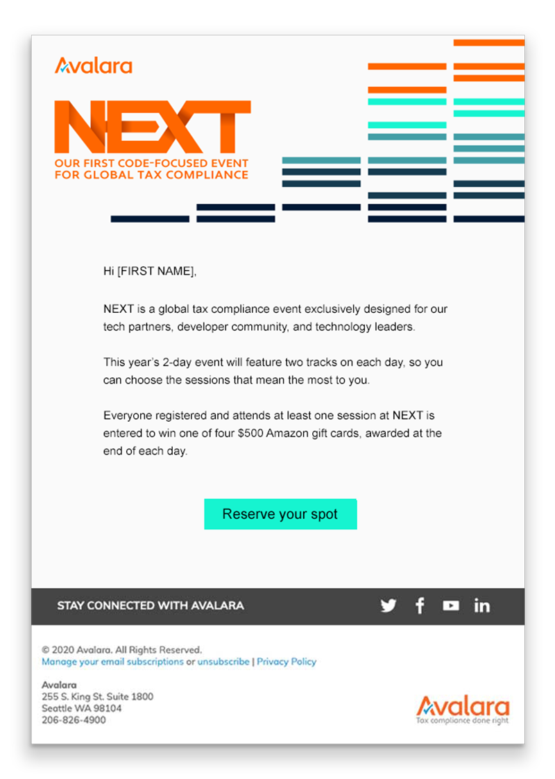
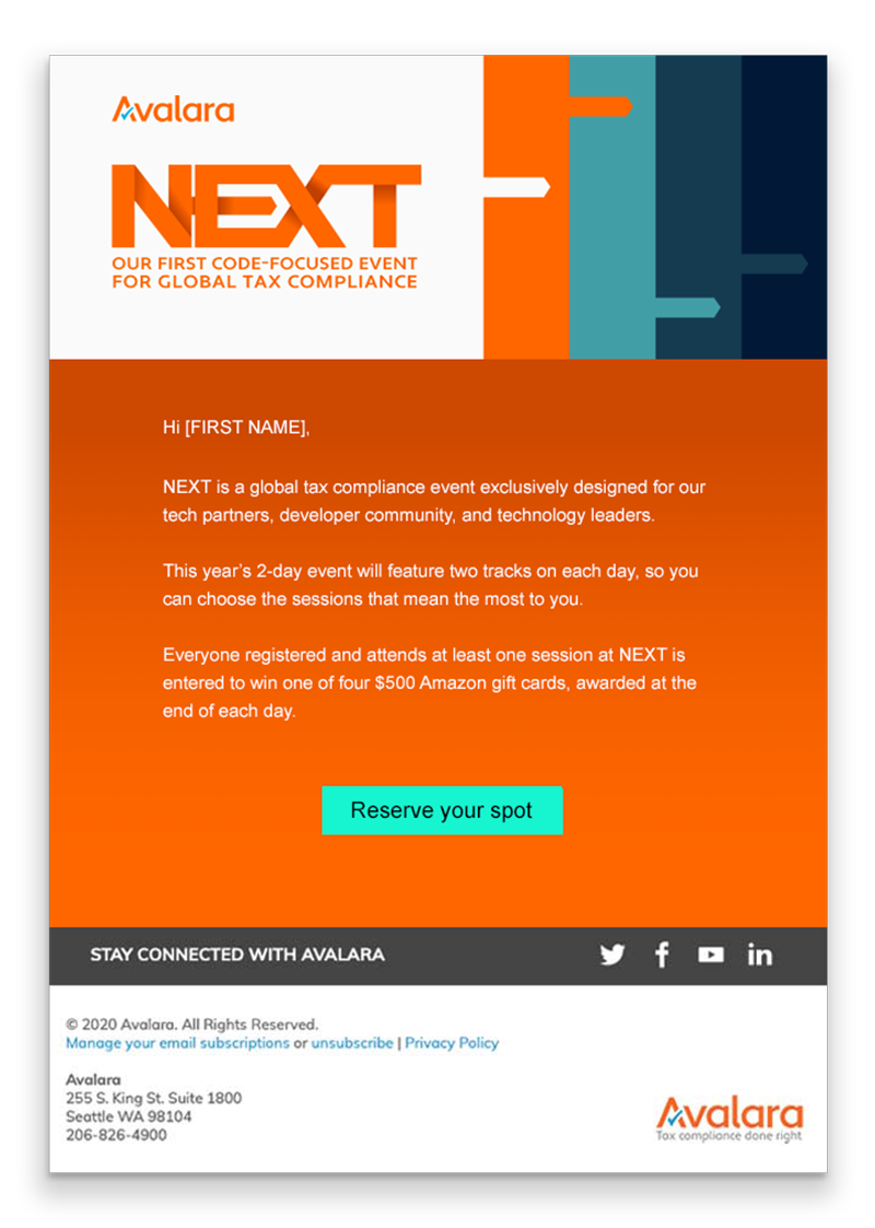
Several email header templates, with color variations.


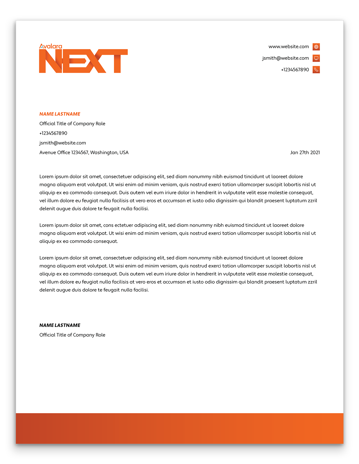
Letterheads

Presentation Slides


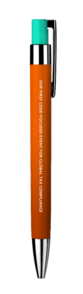
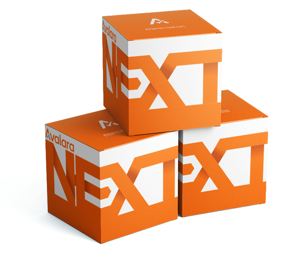
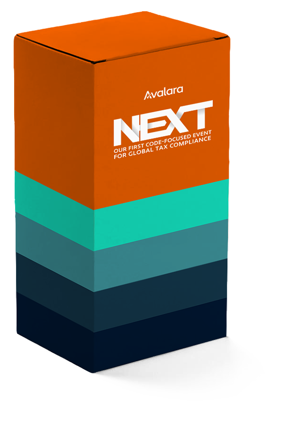
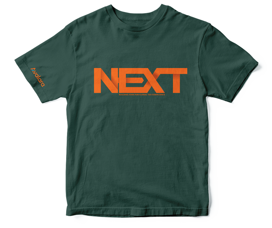
Merch
We provided several ideas for promotional items, packaging, and swag to give leadership a clear vision of how the brand could be applied.


This was accomplished with an incredible team. Thanks goes to:
Creative Direction:
Rick Gore
Project Management:
Liz Tollefson
Designers:
Rick Gore
Jimmy Menkena