
Clarity by design
Taking infographics and datasheets from dense to digestible
Clunky, Cramped,
and Colorless
The infographics and datasheets prior to my designs had good intentions, but they were often hard to follow. They were tightly packed, short on color and relevant visuals, and lacking clear branding (or any branding at all).
Without much breathing room or hierarchy, the documents appeared more like data dumps than designed experiences.
Creativity with
Clarity in Mind
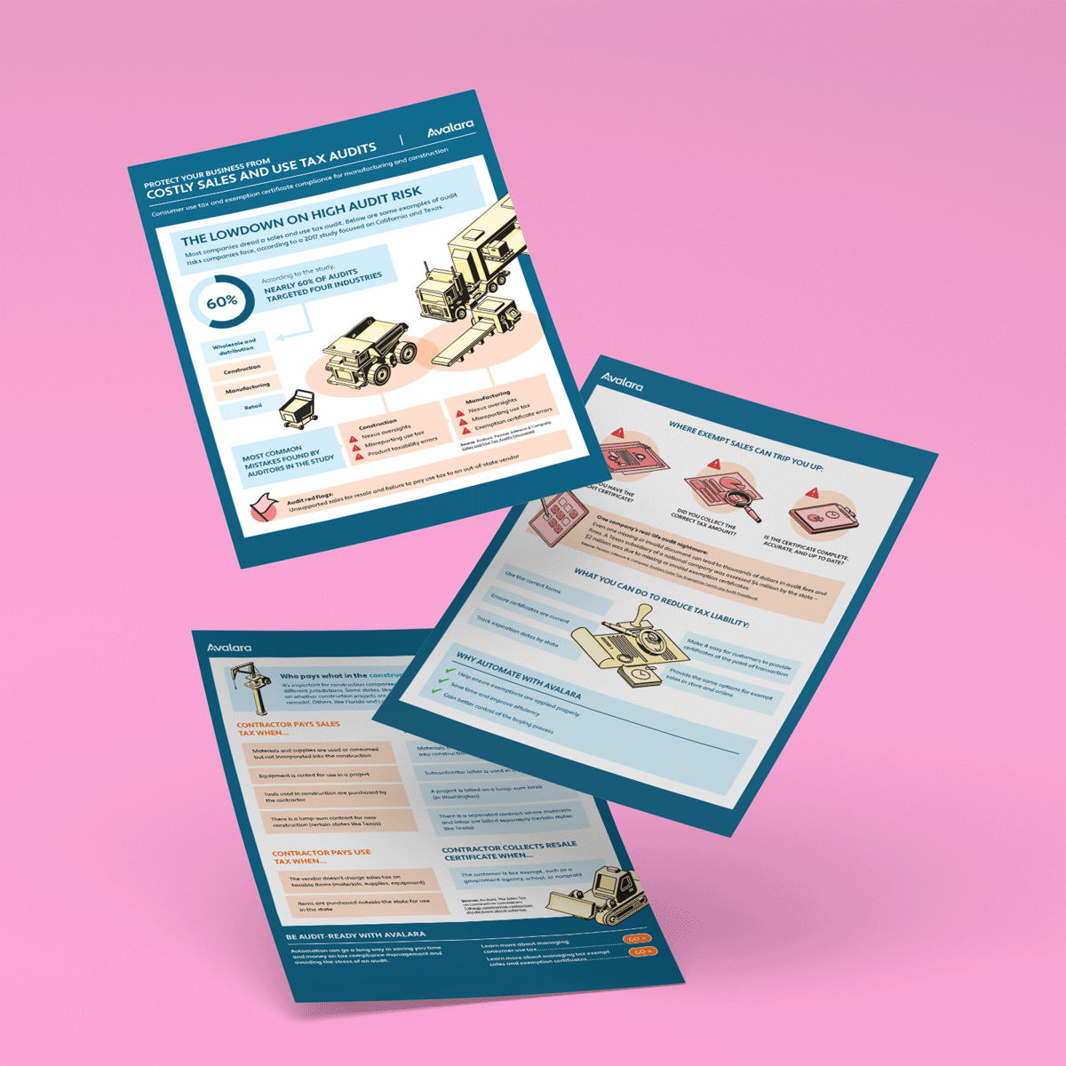
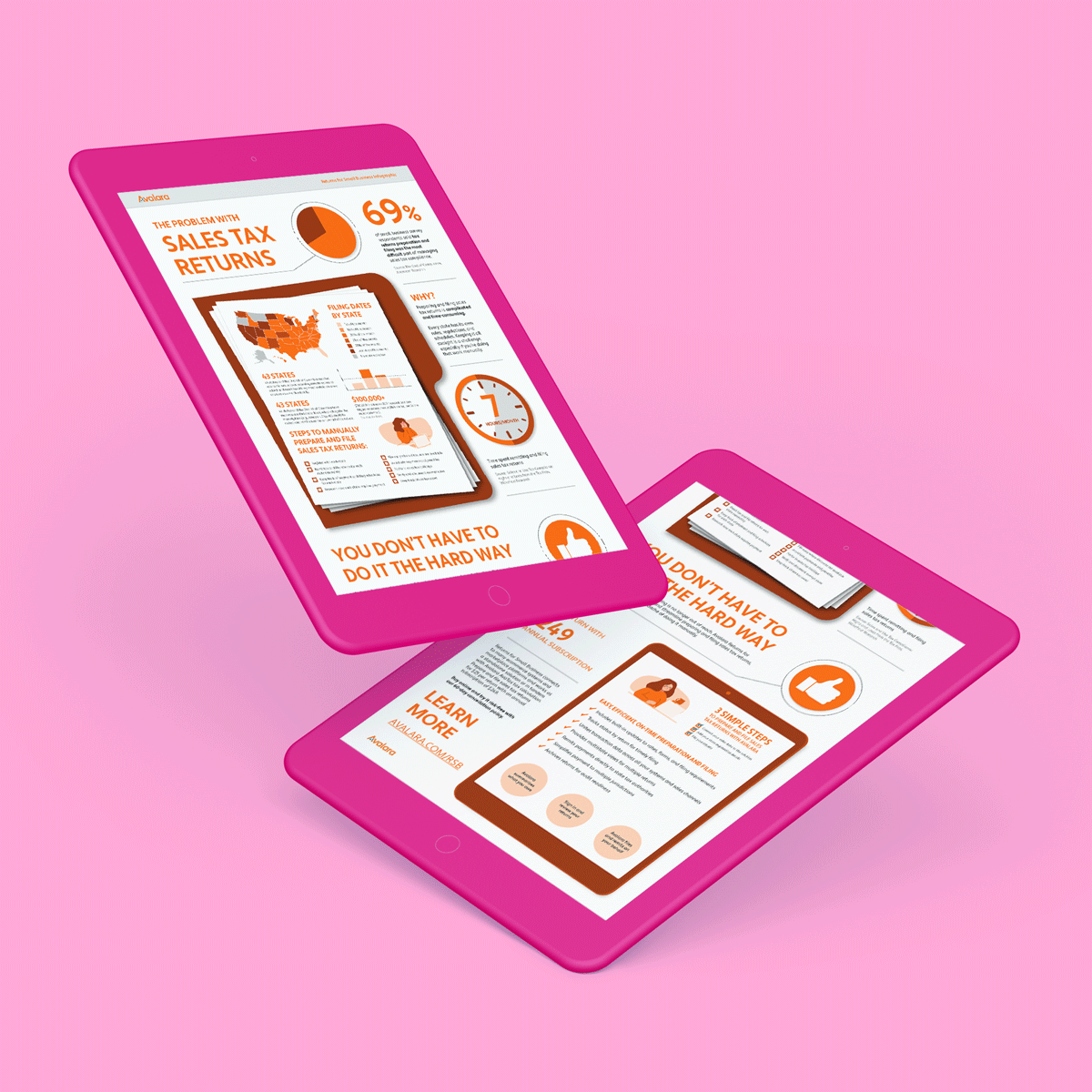
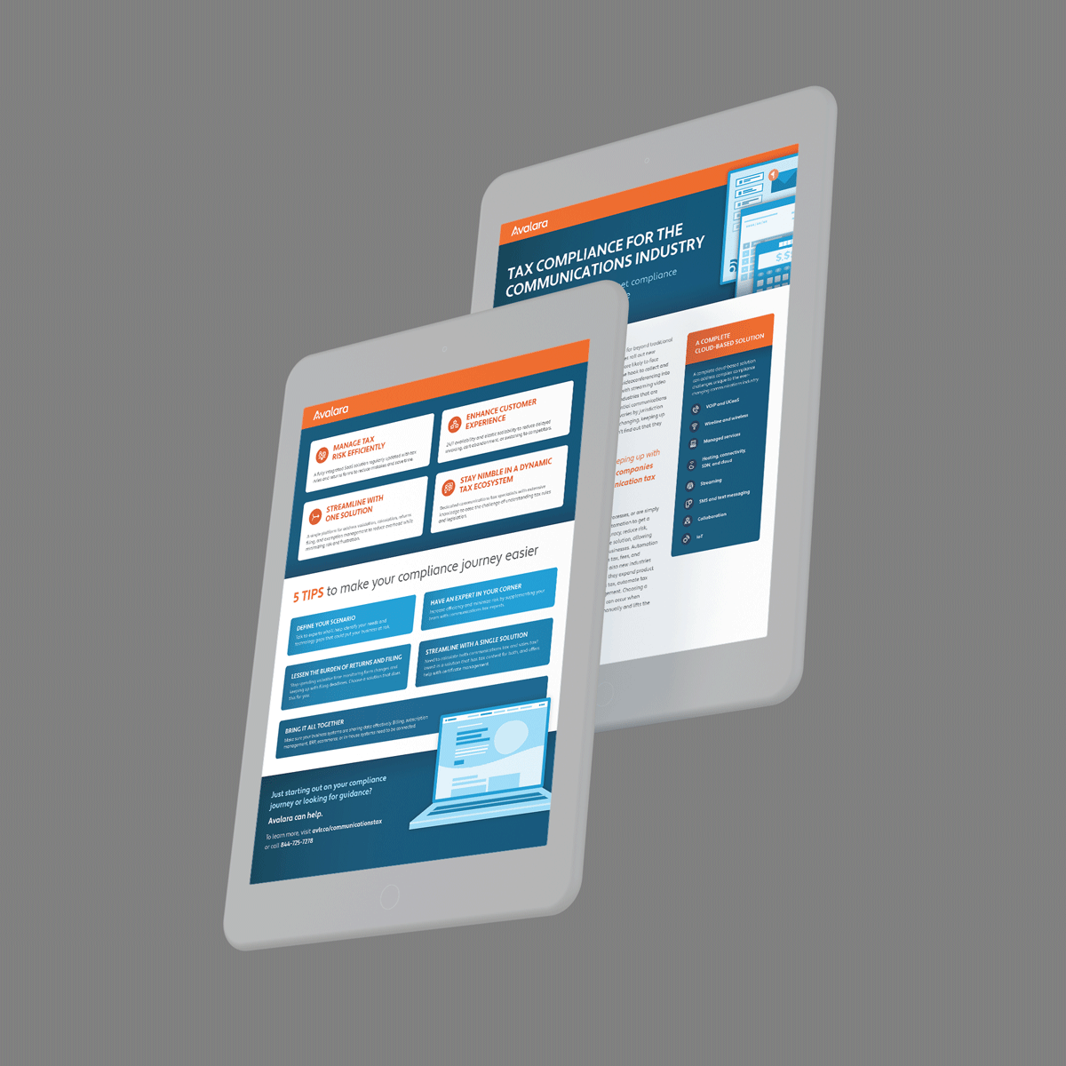
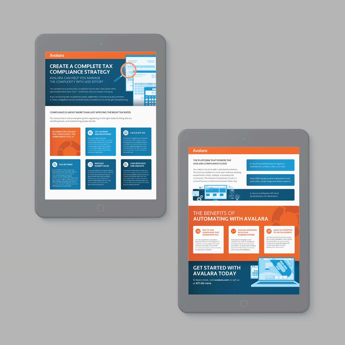
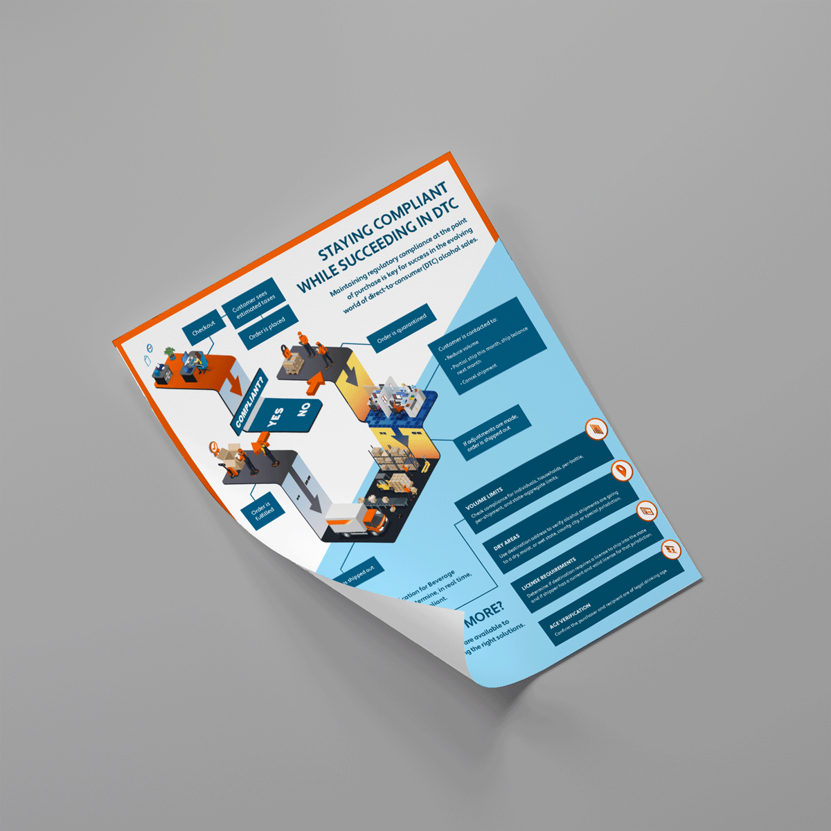
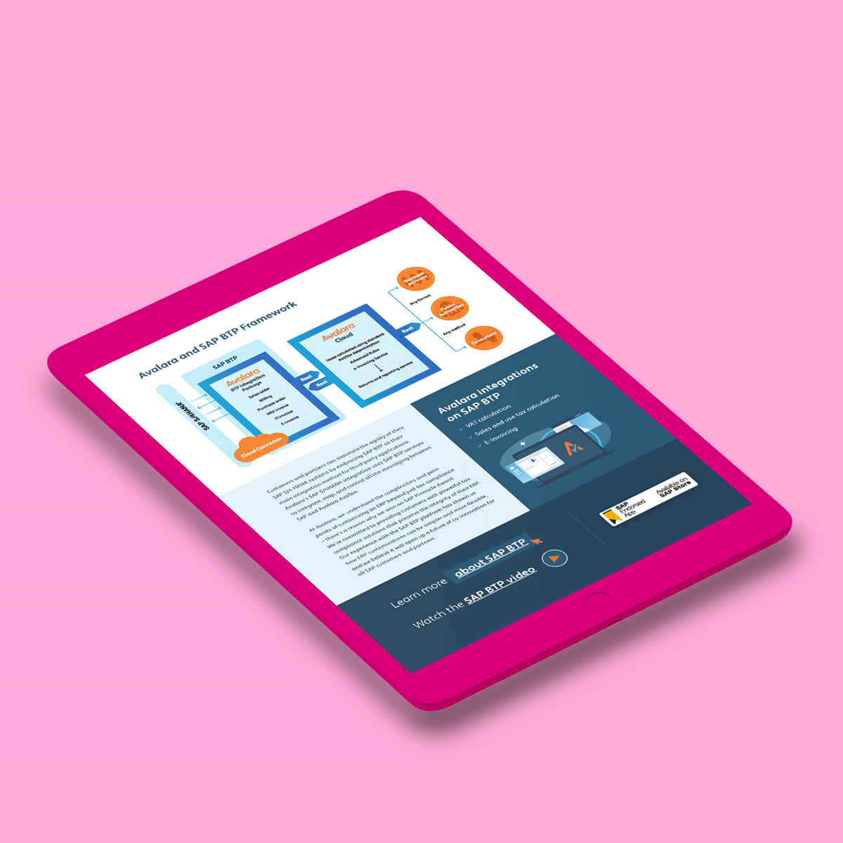
My designs aim to bring a sense of visual delight without sacrificing readability. Color is used to enhance brand presence without overwhelming the composition. When the information gets dense, complexity is packaged into digestible, well-structured elements. The layouts are imaginative but never distracting, designed to guide the viewer, not compete for their attention.


An infographic showcasing some autobiographical statistics of the digital marketing agency Catalysis, designed and animated by Rae Avramenko
Want More Infographics?
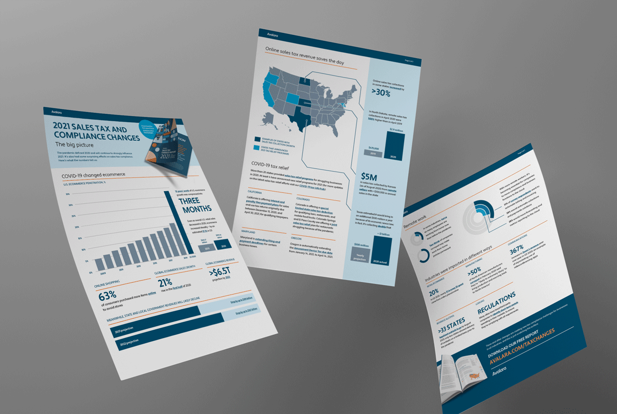
If you're into transforming dense, complex info into something surprisingly clear (and even enjoyable), there's more to see. For the annual Avalara Tax Changes Report, I transformed years of evolving financial data into clear, digestible visuals across 16 reports and hundreds of pages.