
Rethinking the Report
One system that carries consistency across every page

functional but forgettable
The earlier reports were visually flat, inconsistently branded, and weighed down by outdated illustration styles. Color palettes felt faded, and the design wasn’t doing the content justice. These reports delivered information, but without the visual confidence to match the brand behind them.
Polished and purposeful
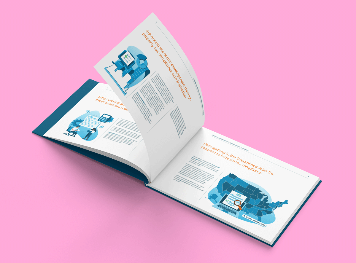
My team and I brought cohesion and clarity to each report with a flexible template that adapts to any topic, all while staying unmistakably on-brand. Refined color palettes and a unified illustration style gave the visuals a clear voice, elevating the content while highlighting its importance.


The big one
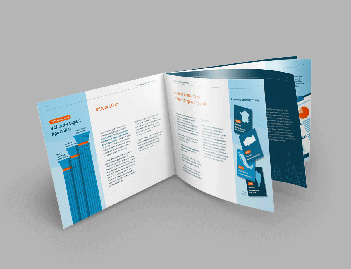
For a large-scale example of consistent, brand-forward report design, take a look at the Avalara Tax Changes project. Spanning five annual editions and eleven updates, these reports use a flexible template and strong visual identity, featuring custom illustrations, clear data visualizations, and messaging tailored to nine industries.