
5 years. 16 reports.
Hundreds of charts.
One flagship that fuels it all:
tellr
How it came to be
The client
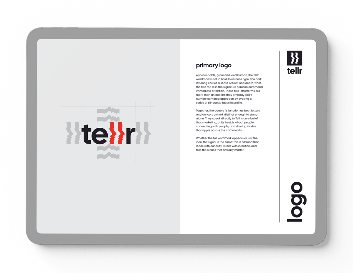
tellr (with a lowercase “t”) is a marketing studio founded by Lindsay Dawson and Danielle Dargavel, two strategists who left the agency world to help small businesses, non-profits, and people-first teams tell better stories. The name is derived from the word “storyteller,” reflecting Lindsay and Danielle's goal of using marketing to build community and speak to clients and their customers on a more honest, personal level. Whether they're shaping a content strategy, a brand voice, or a client's online presence, their approach pairs enterprise-level experience with a genuine, human touch.
The challenge
When Lindsay and Danielle came to me, tellr existed only as an idea. They arrived with a rough sense of color, mood, and direction, but no logo, no public presence, and no name recognition yet. Before any announcement, they wanted the fundamentals in place, including a visual identity and a starter marketing kit to carry them through launch. The brief was simple to state and difficult to execute: I needed to build a brand that felt personal and warm without losing professionalism.
Storytelling, communication, and connection needed to come through in how tellr looked and felt, and not just in what it said.
From there, Pamela Youngberg and I dug into tellr's own values and early direction to distill the concepts that would guide the identity.
Values
Intuitive
Real. Recommendations inspired by insights and research. Proposals that are intentional.
Creative
Captivating. Design and content that feels fresh, resonant, and interesting. A perspective built on curiosity.
Alive
Present. A client experience grounded in the human experience. An approach eager to adapt when necessary.
Interwoven
Connected. Strategies and tactics that compliment. Results at the macro and micro level.
key words
Connection
Perspective
Human
Growth
Direction 1
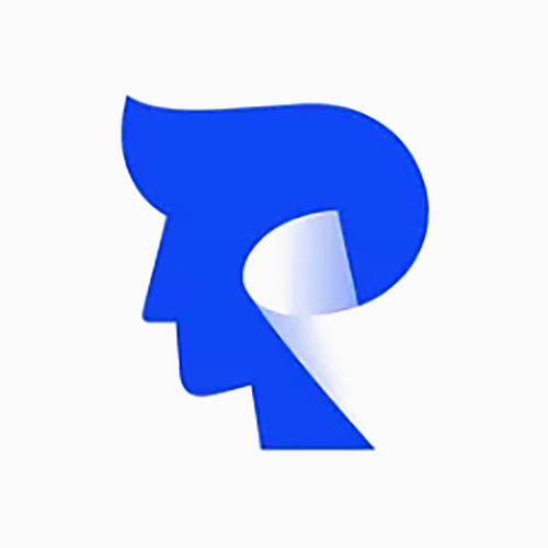
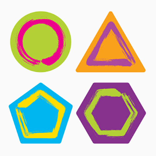
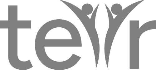
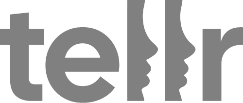
Simple • Negative space • Graphic
This approach leans on clean, bold forms that evoke storytelling imagery without over-explaining it. The concept plays with what's absent as much as what's drawn, revealing an idea in the gaps between the shapes. Think flat, high-contrast logos and icons, styled to reward a second look.

Direction 2
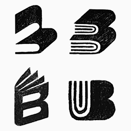
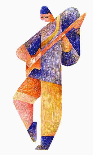
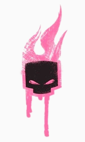
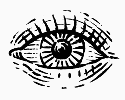
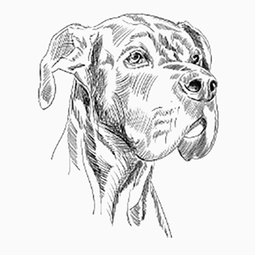
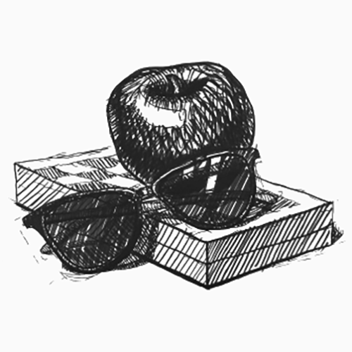
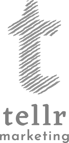
Sketchy • Imperfect • Contrast
Direction two brings in a more textured, hand-touched quality, drawing from pen illustration, lino printing, and brush strokes with visible personality. Ripples and layered lines nod to pages turning or curtains parting, giving the identity a sense of story. It's intended to feel warm and human rather than buttoned-up.
Drawing Out the story
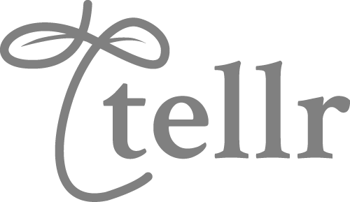
From clean vectors to marks with a hand-drawn feel, I sketched and refined dozens of directions, chasing a logo that could carry the weight of human connection.





Real Gifts for
Real People
If glassybaby could admit that their gifts aren’t perfect (re: one of a kind), then why don’t we own imperfection? So, we honed in on the fact that gifts don’t have to be perfect and people don’t have to be perfect, to be, well, perfect.
Through unexpectedly honest messaging and imagery pulled straight from life’s wonderfully messy middle, we positioned glassybaby’s handmade variations as a refreshing alternative to cookie-cutter gifting, making the brand feel more human, personal, and easy to love.
The Complete Brand Toolkit
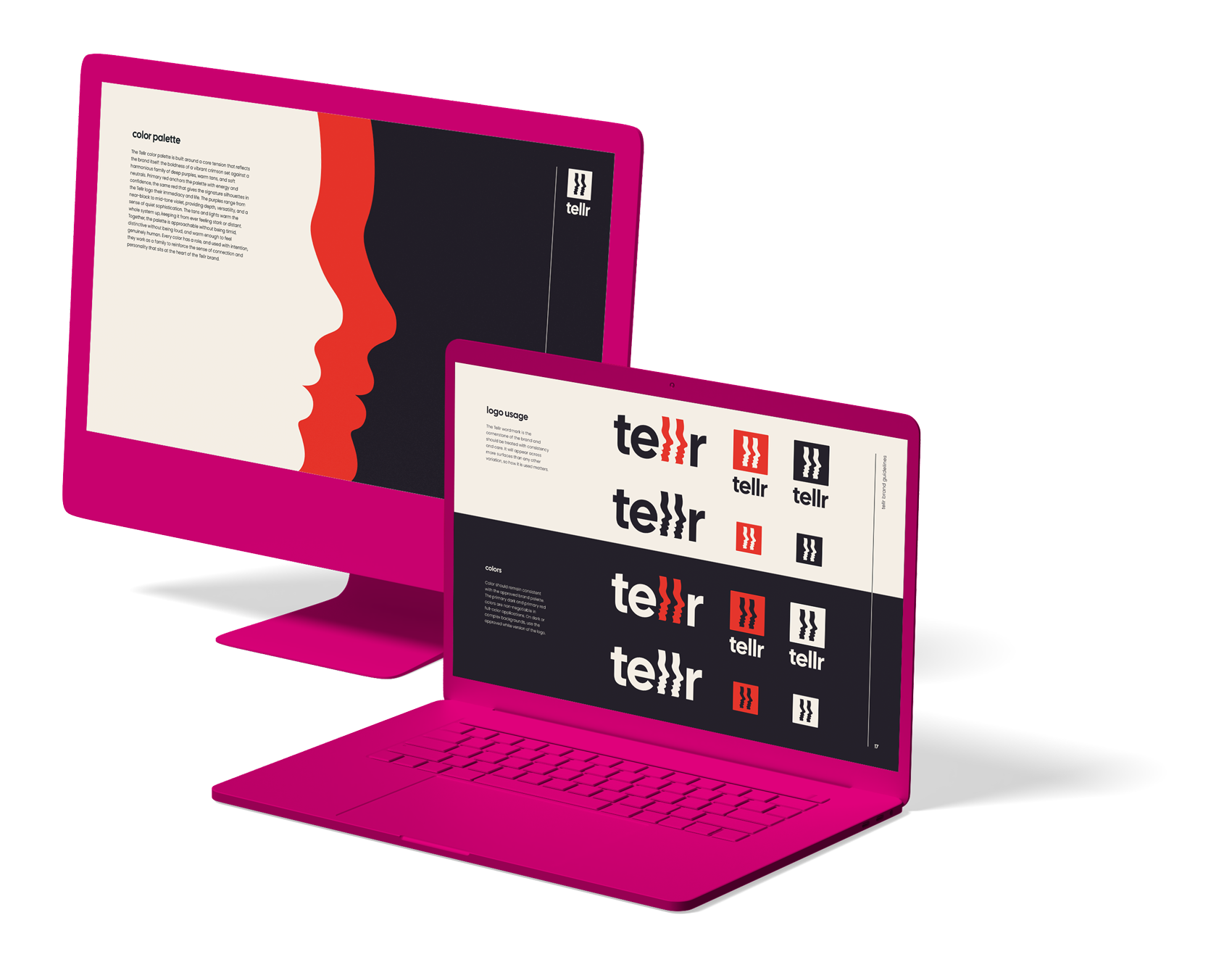
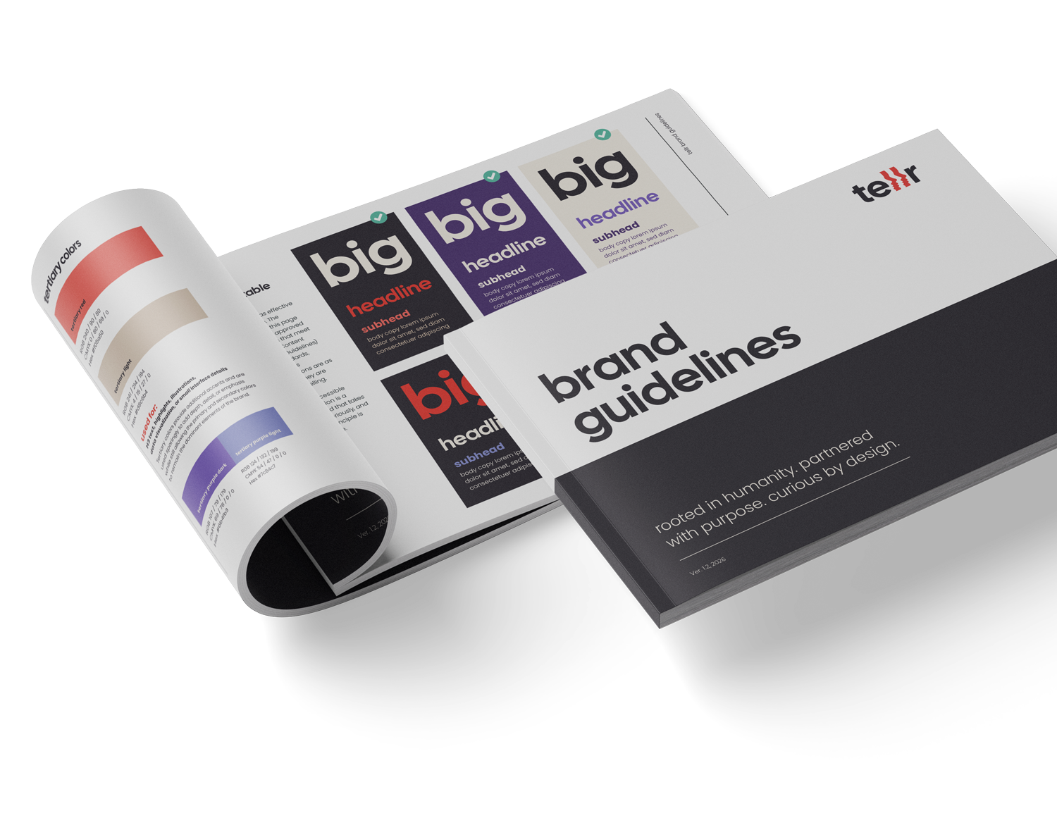
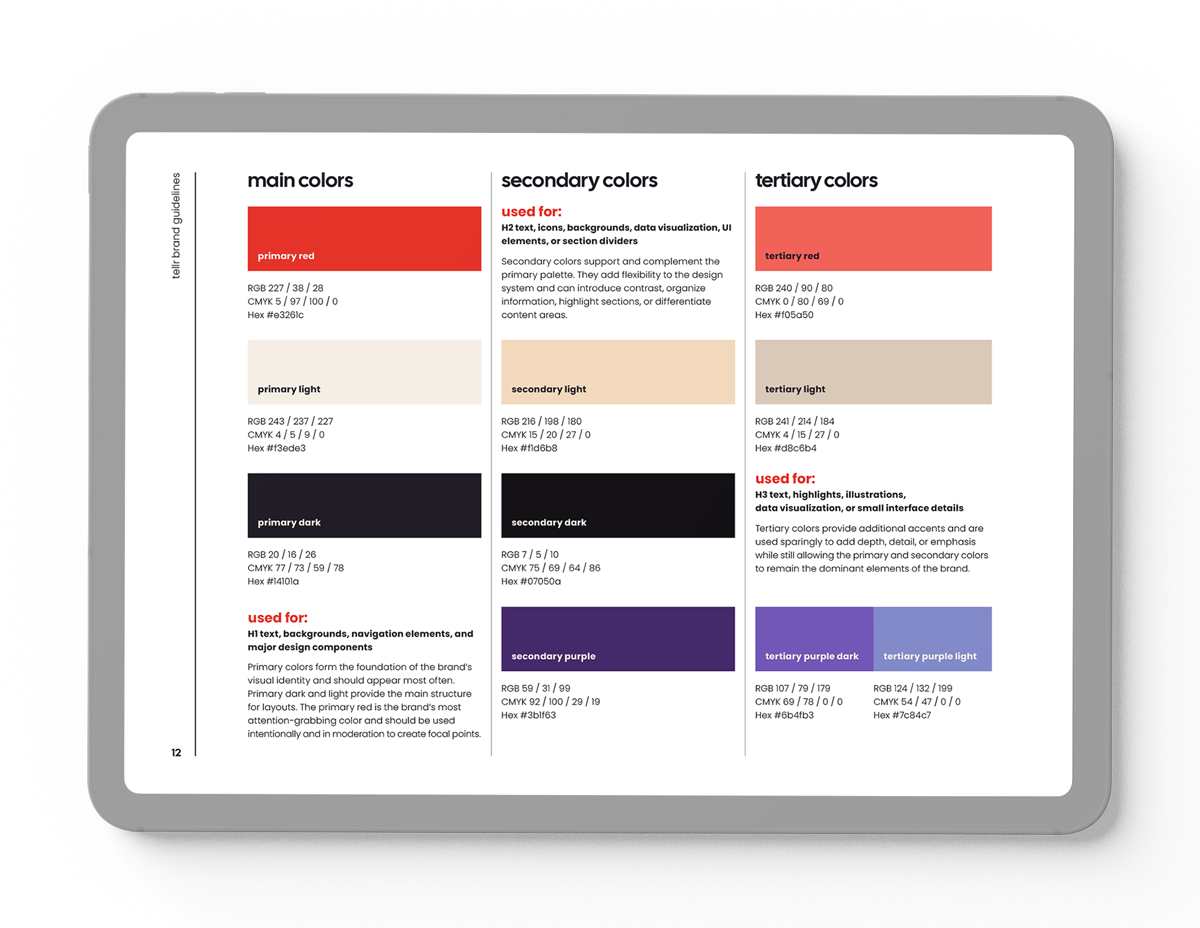
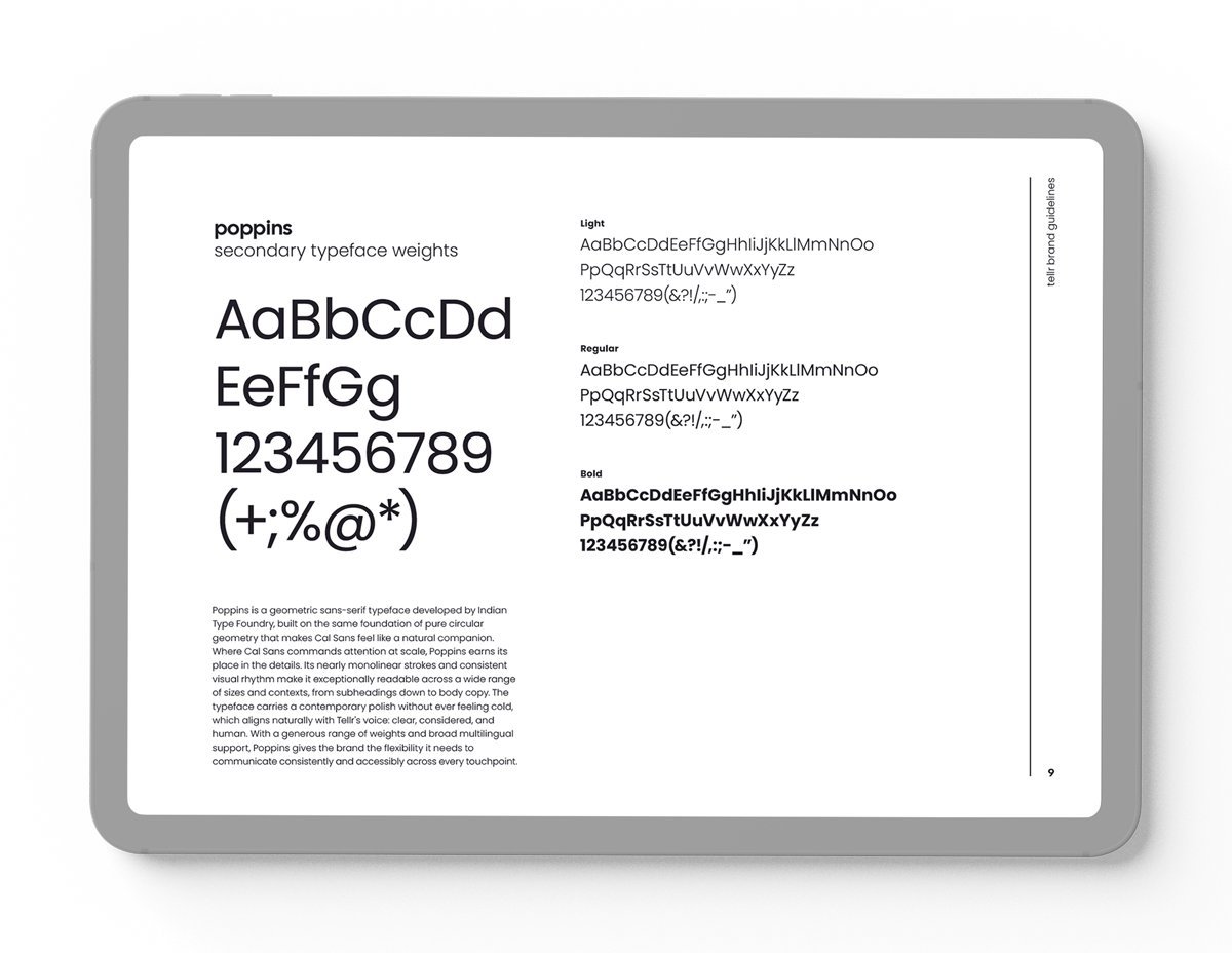
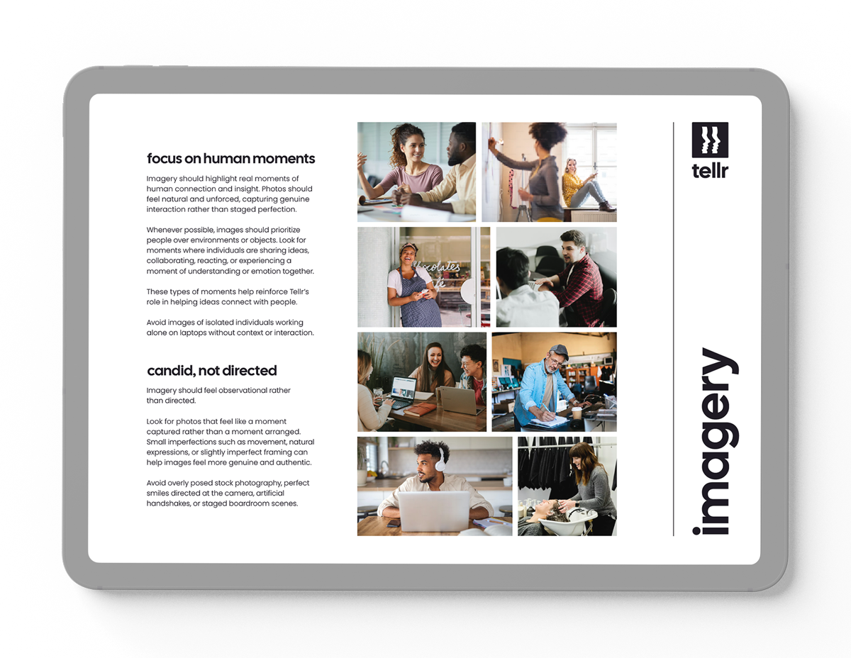
I designed the NEXT event brand guide to cover a wide spectrum of design elements. Starting with the essentials such as logo treatments, typography, and colors, I also provided guidance on iconography, graphic elements, and even approved stock photography. Clean and sleek, this go-to toolkit empowered any design team to create cohesive, on-brand materials for the event.
iconography


line work
ribbons
patterns
This opportunity and great collaboration is all in thanks to:
Founders:
Lindsay Dawson
Danielle Dargavel
Copywriting:
Pamela Youngberg

raeavramenko@gmail.com